
🕒 6 minutes 33 secondes | 👁️ 10101 | 👤 10099 visits | 📊 100%
Understanding Theme Restrictions in Elementor
Vue d'ensemble Elementor and its functionality
Elementor is a powerful page builder for WordPress that empowers users to create stunning and feature-rich websites without needing to know any code. With its drag-and-drop interface, users can easily customize layouts, add content widgets, and design pages to fit their vision. It offers a plethora of design flexibility, allowing users to adjust every aspect of their site with real-time previews.Limitations of default Elementor footer placement
Despite its versatility, Elementor does face some theme restrictions, particularly when it comes to the footer. The default Elementor footer placement is often limited to the site’s theme settings. This means:- Inconsistent Design: Users may find it challenging to achieve a uniform footer design across different pages or sections of the site.
- Lack of Global Settings: Without Elementor Pro, users can’t easily create a global footer that appears site-wide.
- Theme Dependency: The look and feel of footers can be overly reliant on the chosen theme, limiting creative autonomy.
Exploring the Need for Footers Everywhere
Importance of consistent footer design
Having a consistent footer design is crucial for creating a cohesive look throughout your website. Just like how a well-matched outfit can make a person more appealing, a harmonized footer can enhance your site’s professionalism. Here’s why:- Brand Identity: A consistent footer reinforces your brand’s image.
- User Navigation: It helps users find essential links and information easily.
Enhancing user experience with universal footers
Universal footers not only improve aesthetics but also create a more user-friendly experience. Imagine visiting a website where every page looks different at the bottom; it can be disorienting! With universal footers:- Quick Access: Users can swiftly locate contact information, social media links, or privacy policies.
- Improved Engagement: A familiar footer encourages users to explore more content.
Overcoming Theme Restrictions
Introduction à la Elementor Pro
To truly harness the potential of Elementor, upgrading to Elementor Pro is a game-changer. This premium version unlocks advanced features that can elevate your website’s design and functionality dramatically. With Elementor Pro, users can access a wealth of templates, widgets, and customization options that aren’t available in the free version.- Advanced Widgets: Add forms, sliders, and custom icons effortlessly.
- Theme Builder: Create personalized headers, footers, and archives.
Utilizing Elementor Pro’s theme builder for global footers
One standout feature of Elementor Pro is its Theme Builder, which allows users to create global footers that maintain consistency across every page. This means you can design a footer once, and it will appear wherever you choose.- Personnalisation: Tailor footers by adding logos, navigation links, and social media icons.
- Conception adaptée: Ensure that your footers look great on both desktop and mobile.
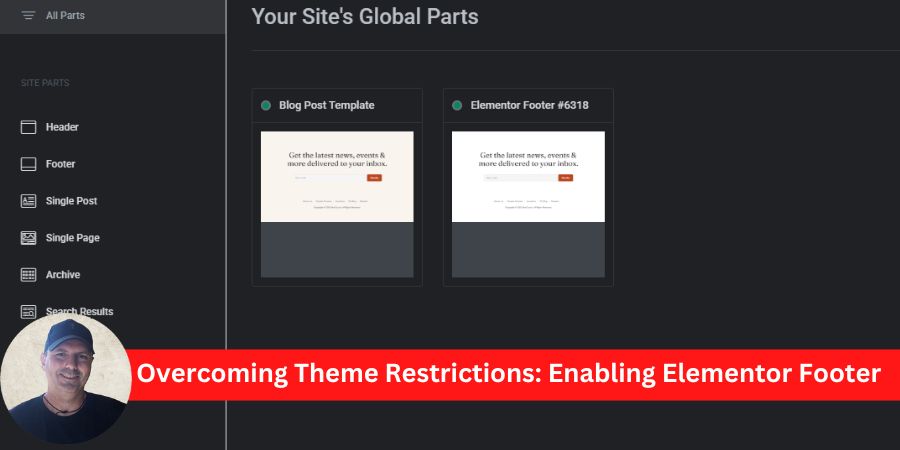
Implementing Global Footers on Elementor
Step-by-step guide to creating global footers
Now that you have access to Elementor Pro, creating global footers is a straightforward process. Here’s a quick guide to get you started:- Open the Theme Builder:
- Navigate to the Elementor dashboard and select “Theme Builder.”
- Select Footer:
- Click on “Footer” and choose “Add New” to create a new footer layout.
- Design Your Footer:
- Use the drag-and-drop editor. Incorporate elements like text, social icons, and links.
- Set Display Conditions:
- Choose “Add Condition” to decide where the footer will appear across your site.
- Publier:
- After saving your changes, hit the “Publish” button.
Customizing global footers for different themes
Customization is key when making your footer fit different WordPress themes. To ensure that your footer aligns with the overall site design, consider these tips:- Color Schemes: Match colors to your theme for a cohesive look.
- Typography: Use fonts that complement those used in other sections of your site.
- Widgets: Depending on the theme, consider varying widget arrangements for better functionality.
Replace the existing footer.php file in your theme with this code:
<?php
// Ensure Elementor Footer is used

if ( function_exists( 'elementor_theme_do_location' ) && elementor_theme_do_location( 'footer' ) ) {

// Elementor's footer will be displayed

} else {

// Optional: Display fallback footer message

echo '<footer class="fallback-footer" style="text-align:center; padding:20px; background:#f8f9fa;">No Elementor footer found. Please create one in Theme Builder.</footer>'; }

?>
Enhancing Design Consistency Across Websites
Benefits of using global footers in Elementor
Utilizing global footers in Elementor can significantly enhance the design consistency of your website. Here are a few key benefits:- Unified Branding: A consistent footer reinforces your brand identity, making it easily recognizable.
- Enhanced Navigation: Users appreciate an intuitive layout, which allows easy access to essential links across various pages.
- Time-Saving: Once designed, global footers save time, as they automatically update site-wide.
Tips for maintaining design coherence with universal footers
To maintain design coherence across your site’s universal footers, consider these helpful tips:- Color Consistency: Stick to your brand’s color palette to ensure harmony.
- Use of Icons: Employ the same style of icons for social media or contact links for a uniform look.
- Responsive Testing: Always check how your footer looks on different devices to ensure a seamless experience.
Optimal Practices for Using Elementor Footers
SEO considerations for global footers
When creating global footers in Elementor, it’s essential to keep SEO in mind. A well-optimized footer can boost your site’s visibility in search engines. Here are some considerations:- Keyword Placement: Include relevant keywords naturally in your footer text, especially in navigation links.
- Structured Data: Implement schema markup for contact information and social media profiles to enhance search engine understanding.
- Internal Linking: Use strategic links in the footer to direct users to important content, improving site architecture.
Mobile responsiveness and footer design best practices
In today’s mobile-driven world, ensuring that footers are responsive is crucial. Here are some best practices:- Simplified Design: Keep footer elements minimal for mobile users, ensuring quick loading.
- Clickable Elements: Make sure buttons and links are finger-friendly for seamless navigation.
- Test Across Devices: Regularly check how your footer appears on various screen sizes to ensure consistent user experience.
Reviewing the Impact of Universal Footers
Analyzing user engagement with consistent footers
The introduction of universal footers can significantly influence user engagement on a website. Consistent footers provide reliable navigation, leading to:- Reduced Bounce Rates: Users are less likely to leave if they can easily find what they need.
- Increased Page Views: A well-structured footer can guide visitors to additional content, enhancing their exploration of your site.
- Improved Trust: Professional-looking footers instill confidence in users, encouraging them to stay longer.
Case studies on improved website aesthetics and functionality
Several companies have reported remarkable results after implementing universal footers. For instance:- E-commerce sites: One online retailer saw a 20% increase in sales after streamlining their footer with essential links like promotions and customer support.
- Blogs and content sites: A popular blog improved user feedback scores by 30% simply by enhancing their footer design for better accessibility.


